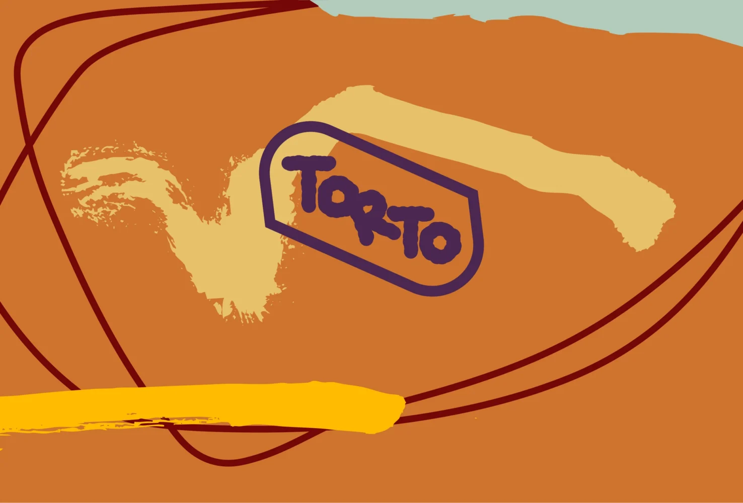
Restaurant · Branding
Torto: building brands all over the world
- Client
- Torto Cozinha
- Sector
- Restaurant
- Location
- Brazil
- Year
- 2025
- Services
- Branding
- @tortocozinha
The brief
Torto Cozinha is the restaurant São Paulo’s critics went looking for in Pompeia: 34 seats, chef Bruno Nogueira at the stove, Poliana Rodrigues running the room, and French cooking taken, in the house’s own words, “from classic to chaos”. Veja São Paulo gave it three stars and praised French technique in conversation with the cuisines of the world; Guia Folha gave it three stars and called its bread with egg and caviar the best starter of the visit. Guests rate it 4.7 on Google.
Torto means bent in Portuguese, and that is the point: a French kitchen that refuses to behave. The house needed a restaurant brand identity with the same nerve, ready before the first table was laid. We built it in 2025, and it carried the soft opening.
Sources: Veja São Paulo, Guia Folha, Google.
The idea
Recognised at a glance. Never the same twice.
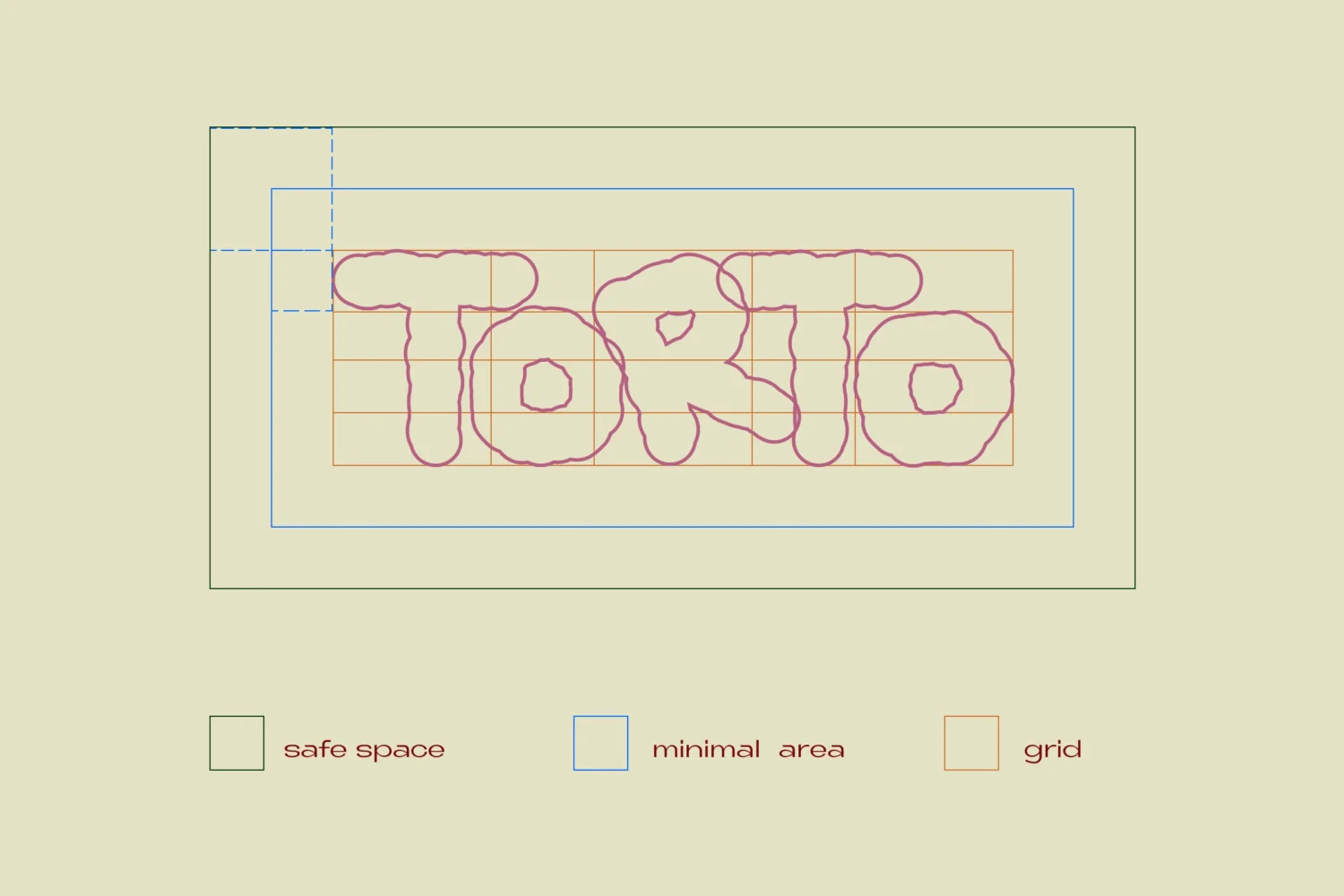
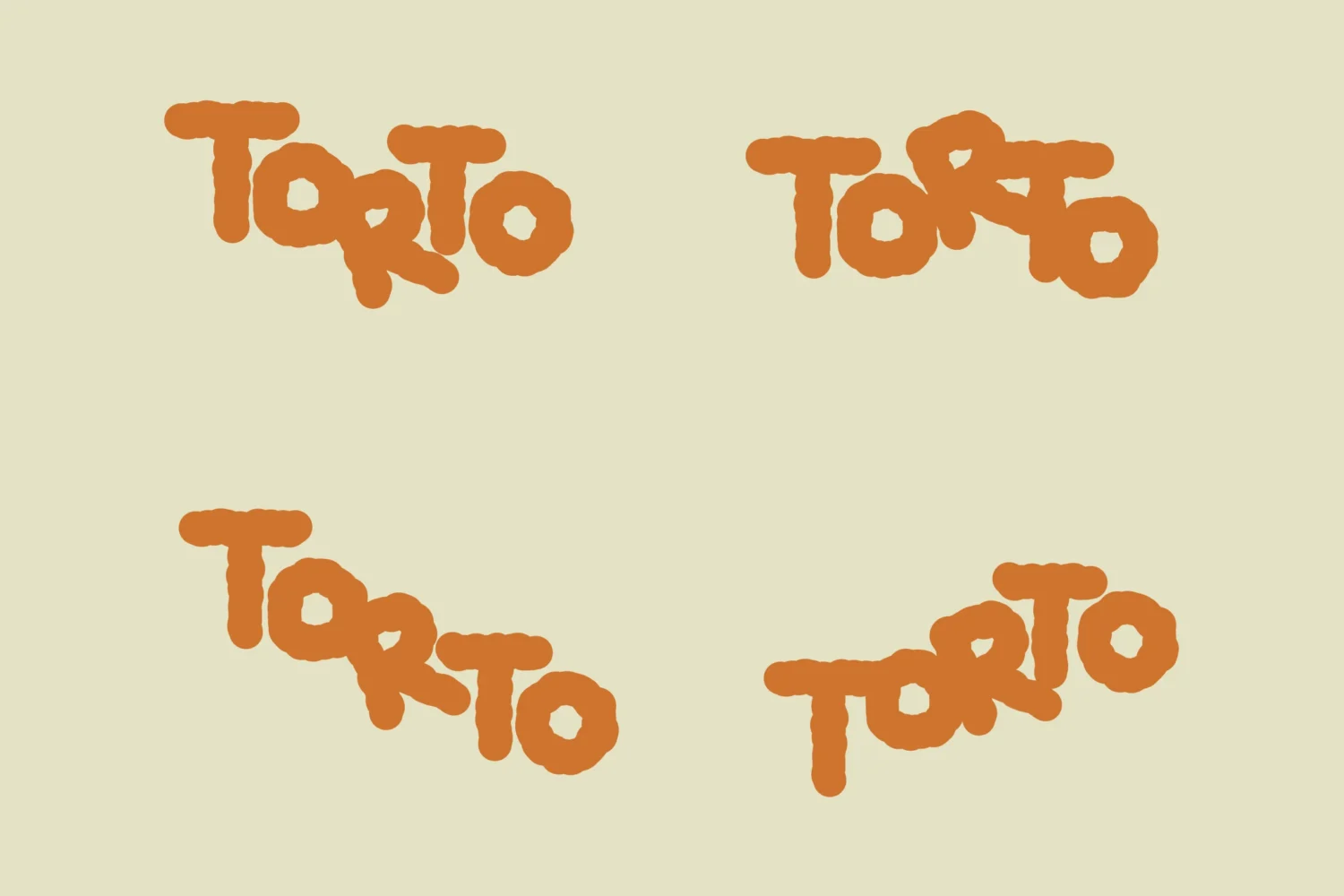
A new restaurant has months, not years, to become a name. So we made the name the brand: drawn by hand, every letter leaning its own way, on a structure strict enough to be taken apart, put back together and still read as Torto. People spot it on a poster, a menu or a feed, and the house never has to repeat itself.
What we made
One hand-drawn name, and everything a restaurant needs to use it.
Logo
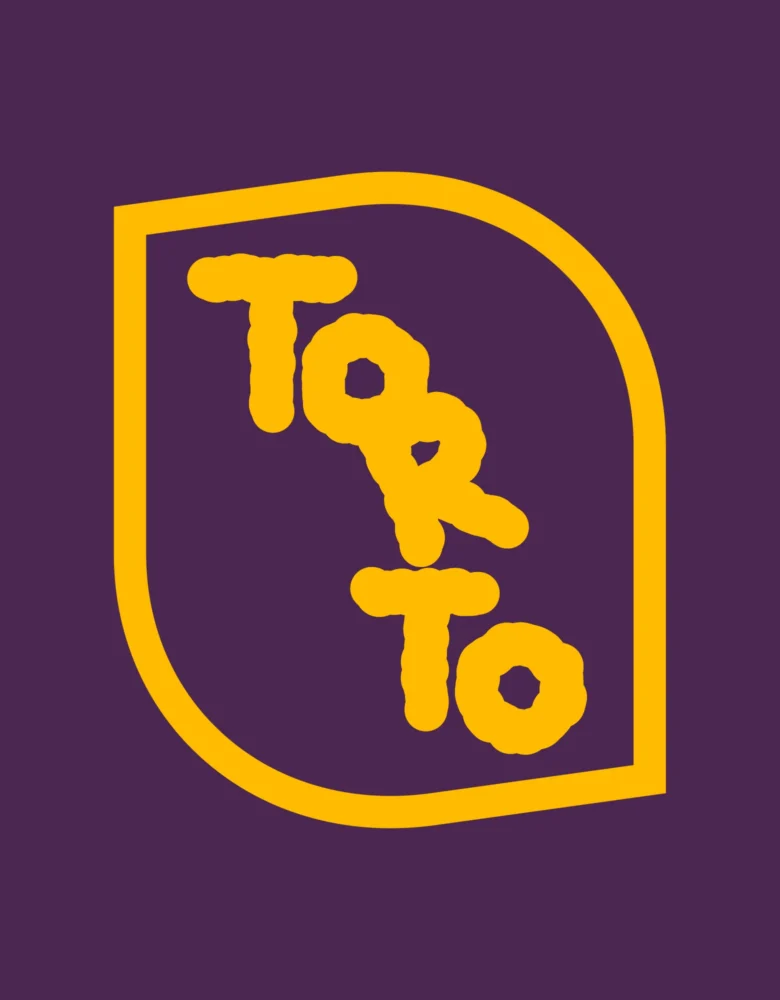
The name in thick letters drawn by hand, each a little off its axis. Unmistakable, large or small.
Sixteen versions
Wide, tall, framed, tilted. Whatever the space, one of them fits.
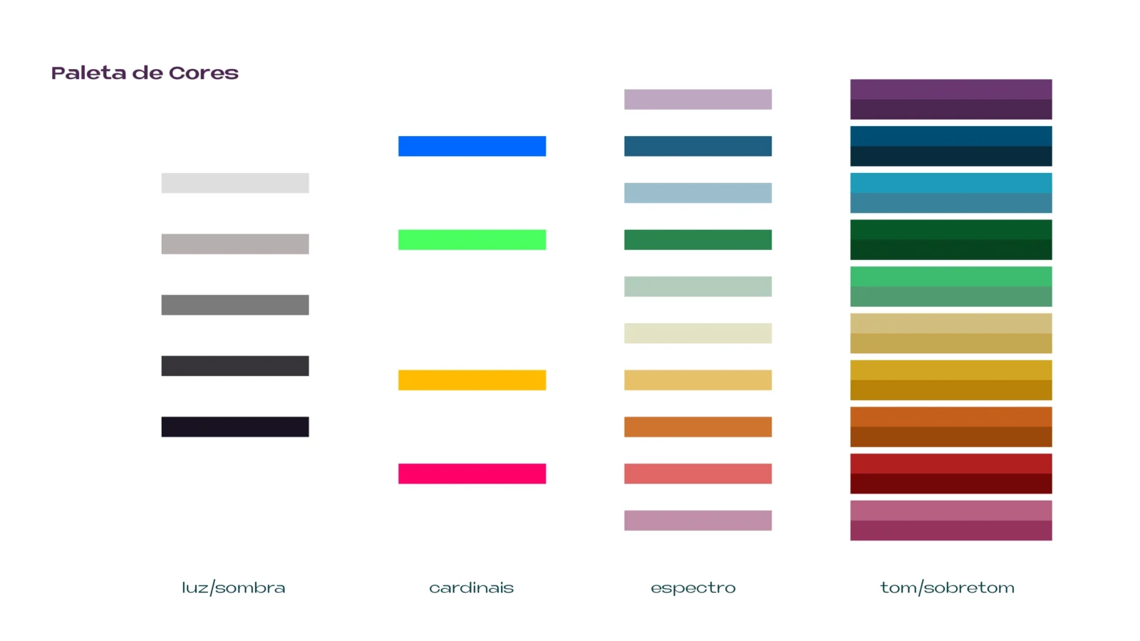
Colour
Loud when the brand shouts, quiet when the food should speak.
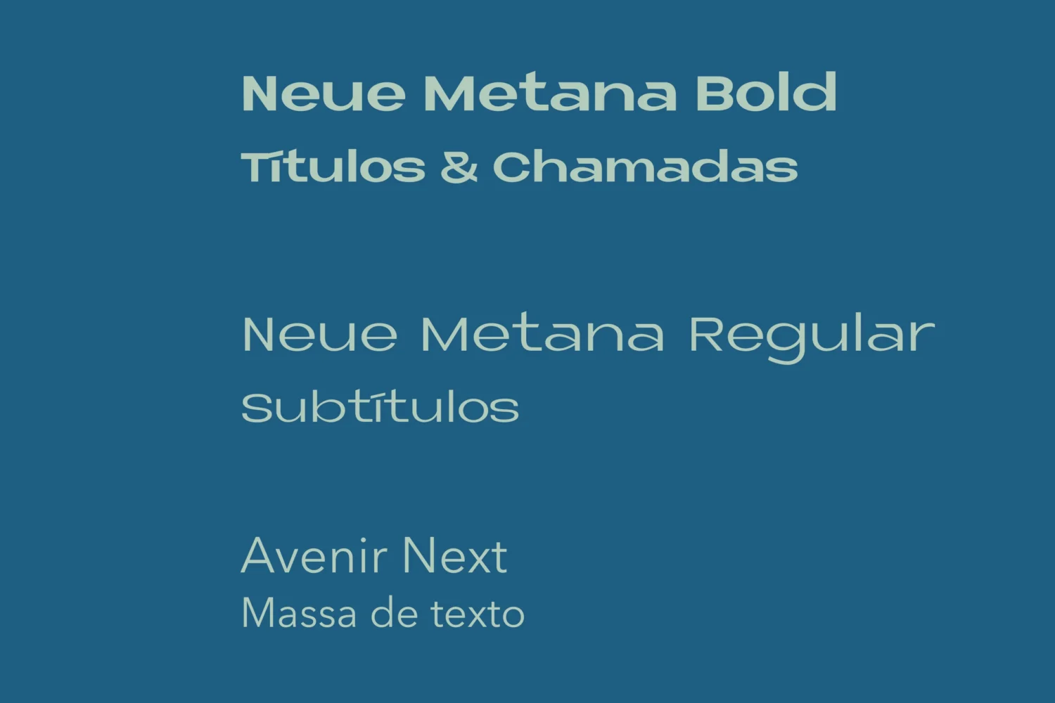
Typefaces
A headline typeface with the logo’s attitude, and a calm one for everything a guest needs to read.
Forks
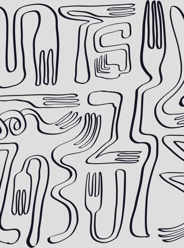
Bent, looped and stretched out of shape. The house’s signature, and nobody else’s.
Brushstrokes and grain
Scribbles, strokes and rough paper that turn a plain announcement into something worth stopping for.
Layouts
Three ready layouts, so a post or a poster comes together in minutes.
In motion
A brand built to move.
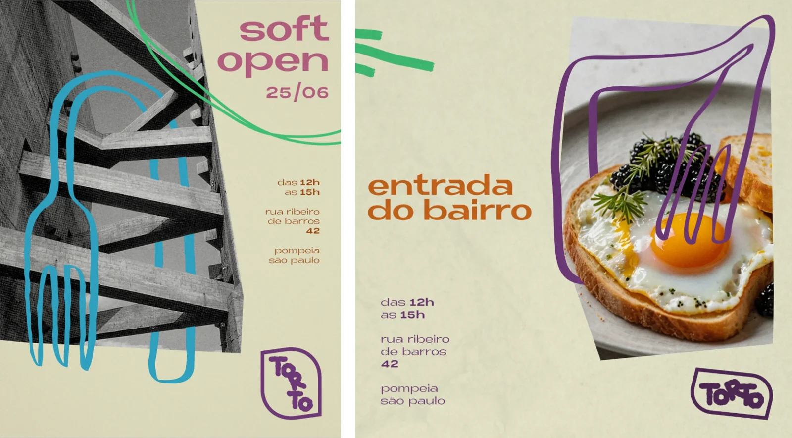
In the world
It carried the opening.
The soft opening announcements were the first pieces out: a photograph cut at an angle, a bent fork on top. It could only be Torto. For what came out of the kitchen next, follow Torto on Instagram.
Delivered
A complete identity and the manual to run it, ready before the doors opened.
The house owns its logo in sixteen versions, its colours and typefaces, the fork drawings, the brushstrokes and three ready layouts, plus a manual that shows how to make the next piece. The whole project is also on Behance.
Agency: Odduel.
Your turn
Opening a restaurant, or running one that deserves to be better known?
Our branding service builds identities that get a business recognised, from this kitchen to a name in electronic music. Tell us about yours.