Picture framing · Branding
Built like a frame: a framing shop rebranding
- Client
- MONU Molduras
- Sector
- Picture framing
- Location
- Brazil
- Year
- 2025
- Services
- Branding
- @monumolduras
The brief
MONU makes other people’s pictures look their best. Its own name was due the same care.
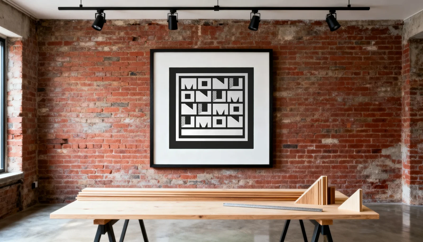
MONU Molduras is a framing shop in Brazil. It frames to measure and to museum standard, stretches canvases and mounts large works for artists. The shop is also a small gallery, with brick walls and works on show.
Here is the catch with a craft done well: a good frame goes unnoticed. The picture gets the attention and the framer gets none. So this framing shop rebranding had one job: give MONU a name people spot from across the street and remember when they next have something worth framing.
The idea
Build the name the way MONU builds a frame.
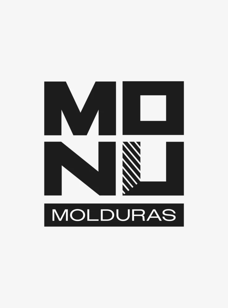
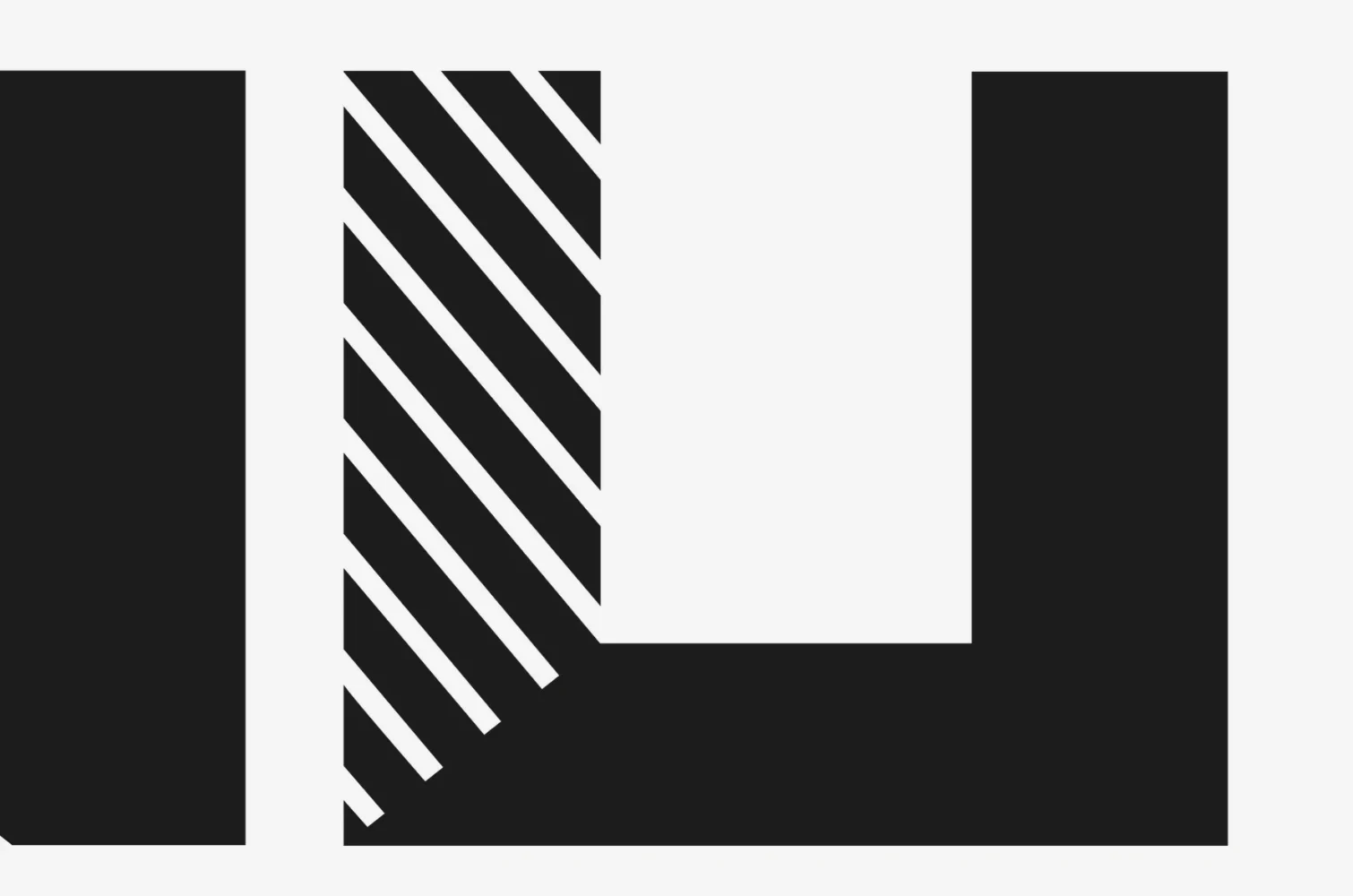
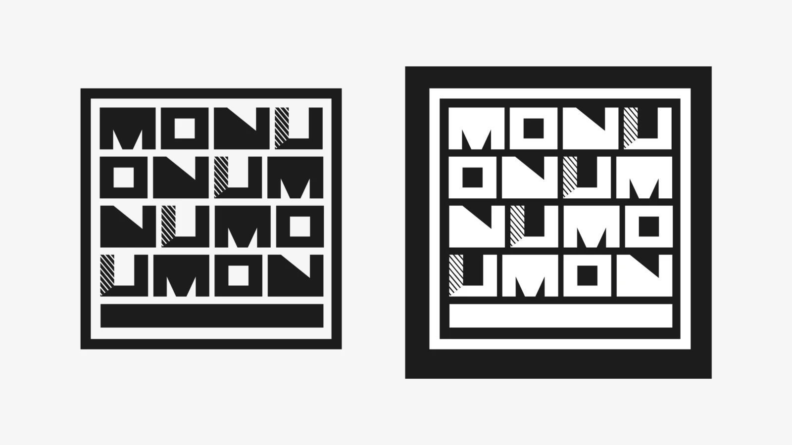
People judge a framer on square corners and clean joints, so the logo is made of them. Four heavy letters, each one a solid block. The O is a square with a square opening: a frame seen from the front. One stroke of the U is cut on a slant, like the joint at every corner of a frame. MONU’s name already stood in two rows, MO over NU; we kept that, the one thing its customers knew, and redrew everything else. And no colour at all, because whatever goes inside a MONU frame brings its own.
What we made
One logo, and everything a shop needs around it.
Readable from the pavement
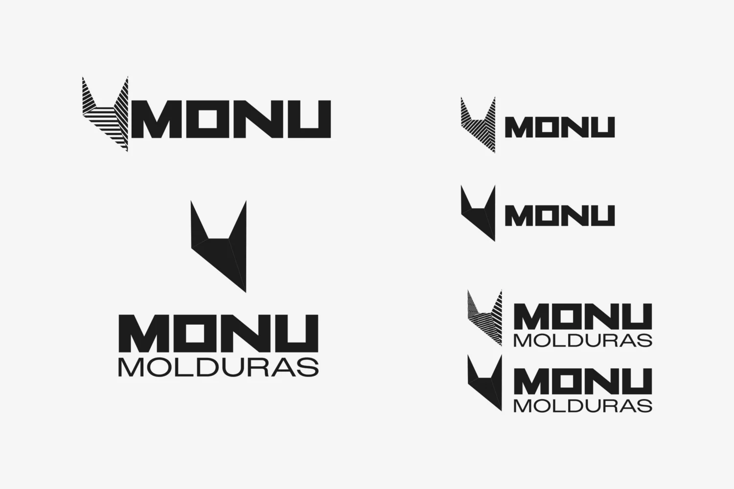
Four block letters over a bar that spells out the trade: Molduras, Portuguese for frames. You know what the shop does at a glance.
A symbol for the small places
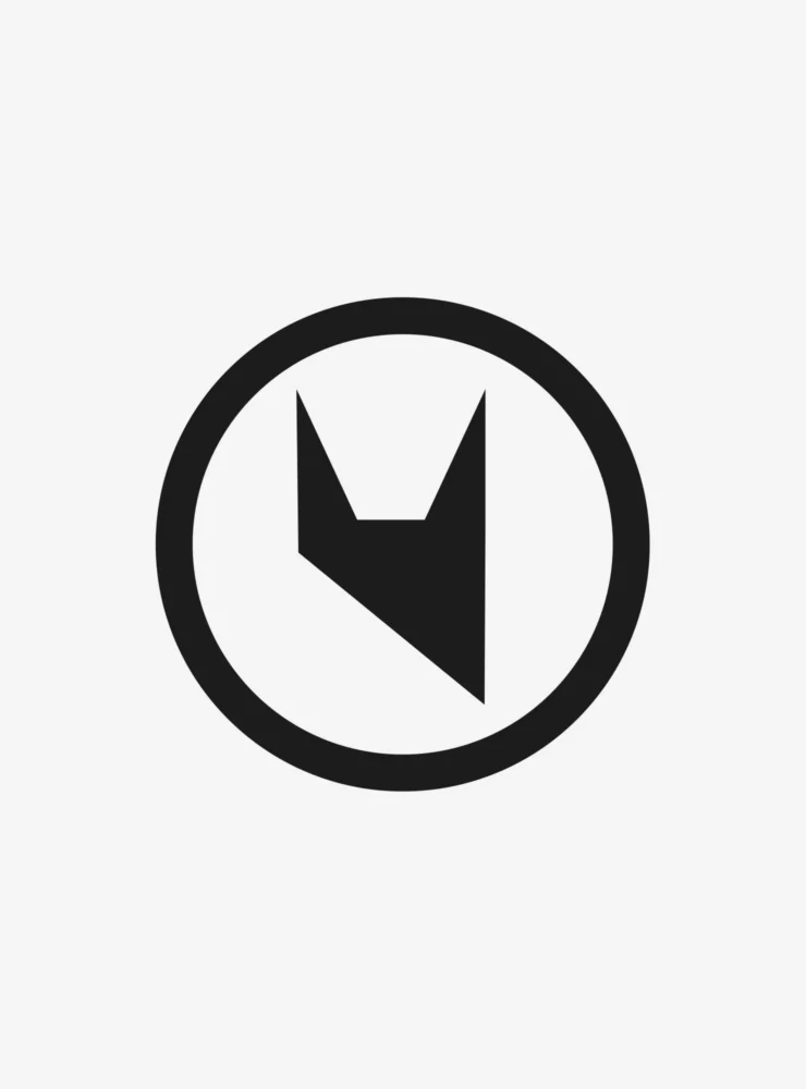
One sharp shape, cut from the M and the N, for a stamp, a sticker or a profile picture, where the full logo would be too much.
A version for every space
Wide, stacked or square. Whatever the sign, the label or the screen, there is a logo made to fit, so nobody ever has to stretch one.
Black and white, both ways
Black on white or white on black, it sits as well on a dark sign as on a white card. One colour also keeps every label and bag simple to print.
A pattern of its own
The four letters shuffled row by row: MONU, ONUM, NUMO, UMON. Something to print, hang or post, so the logo does not have to do all the work.
MONU galeria
A second line under the same four letters, drawn to match, so everything MONU puts its name to looks like one family.
In motion
A logo built like a frame can be put together like one.
In the world
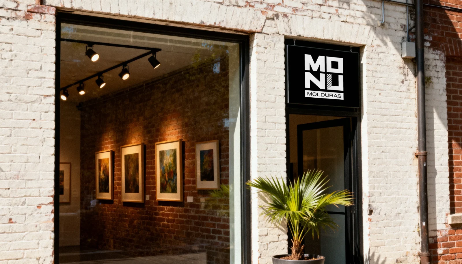
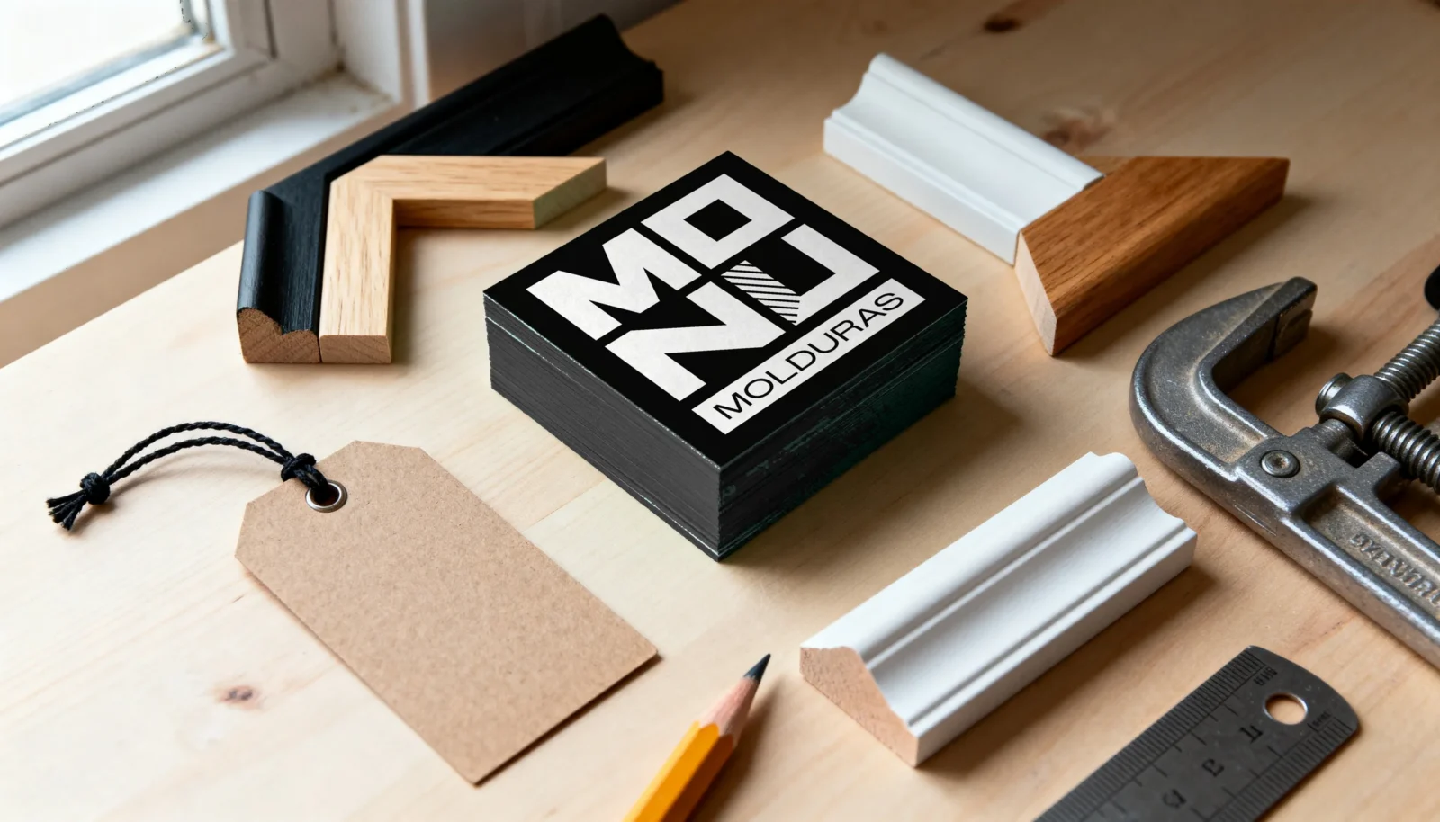
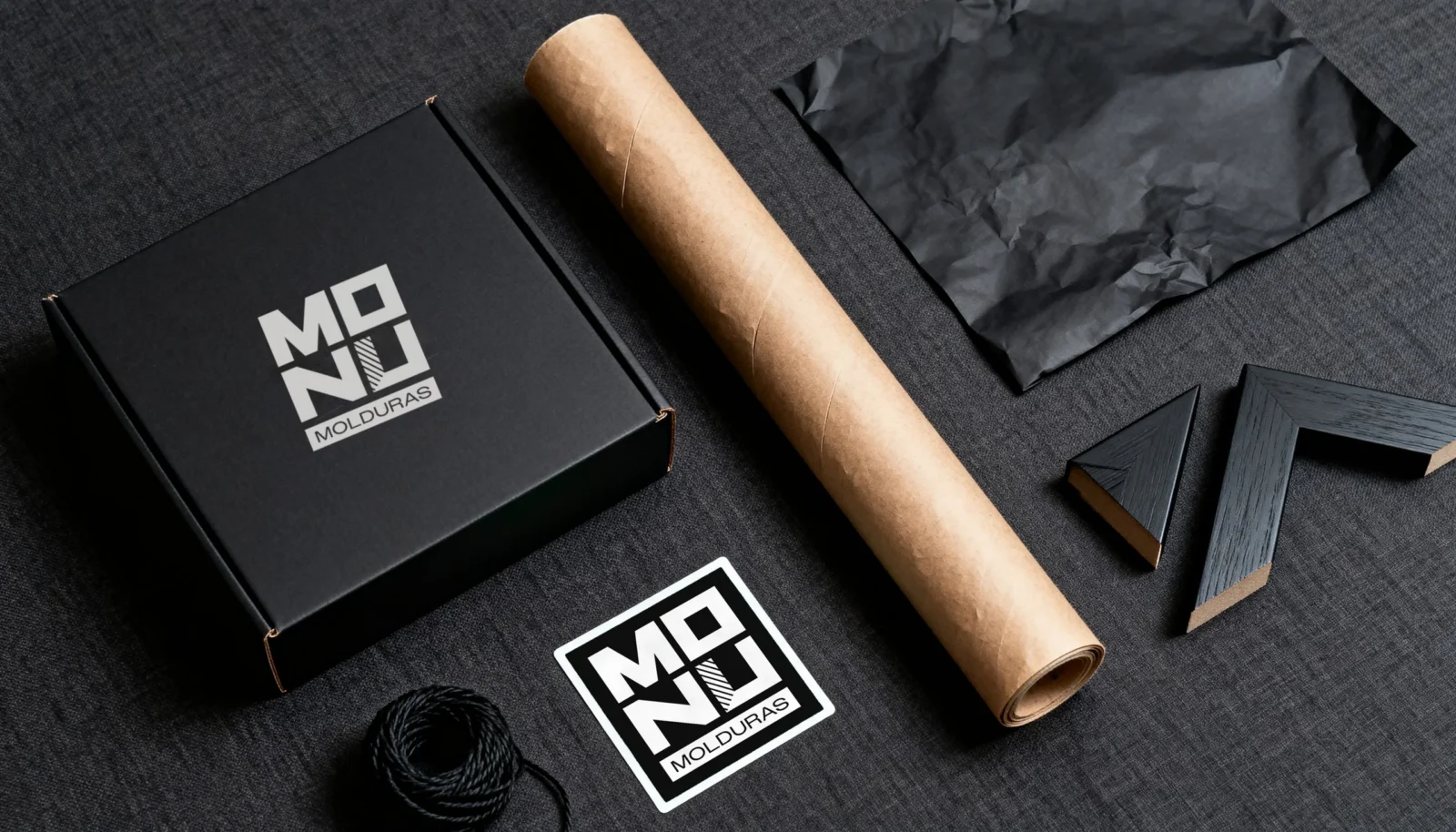
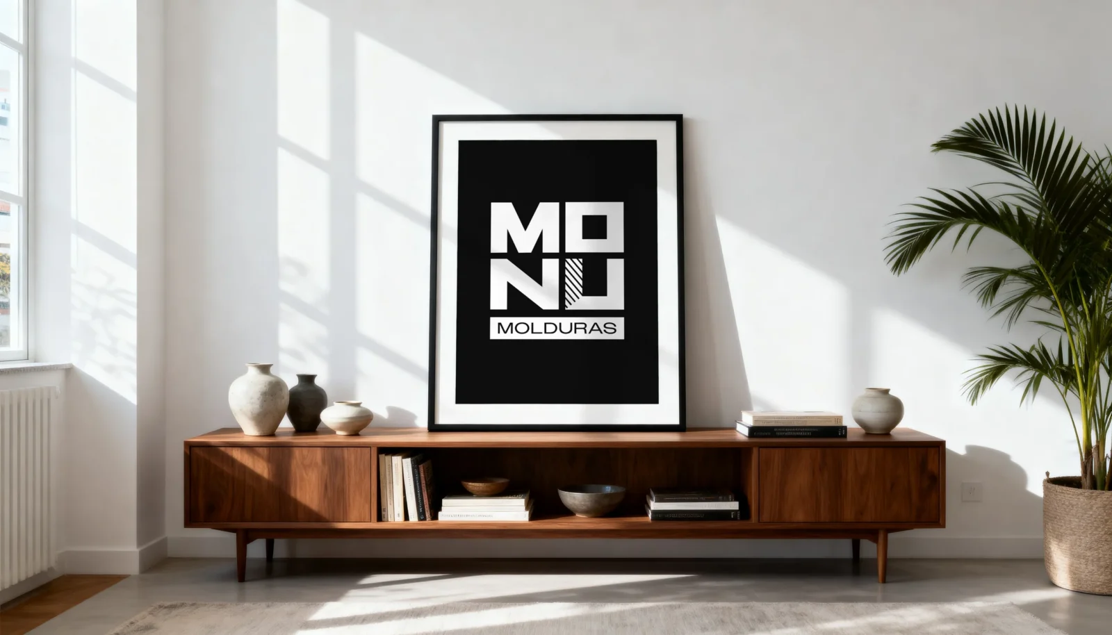
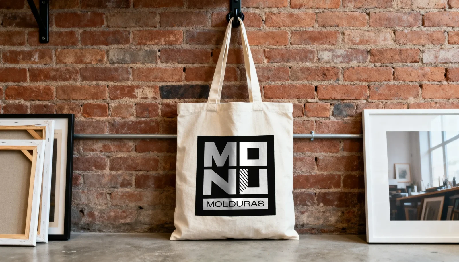
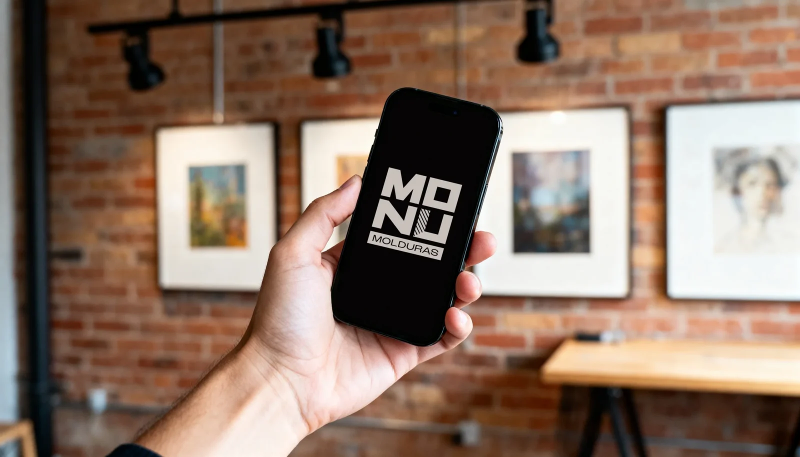
From the sign over the door to the wrapping on a finished frame.
The applications shown here are visualisations. The logo itself is already at work: it is the face of MONU on Instagram.
Delivered
MONU now owns a complete identity: the logo, the symbol, a version for every space, the MONU galeria line and the letter pattern, all in black and white.
Agency: Odduel
Your turn
Is your work better than your logo?
Our branding work starts with what makes your craft yours and builds the name around it, as it did here and in our identity for Rainbow Conspiracy. Tell us about your business.