
The form design best practices that lift completion are simple to state: ask only for what you need, label every field clearly above it, use one column, let browsers fill in what they already know, explain errors next to the field in plain words and confirm success clearly. Most forms lose people not because of their look but because of one unnecessary question, an unclear label or an error message that blames the user. This guide covers how to improve form conversion, a step-by-step process, field-by-field rules with real examples, accessibility and privacy, how long the work takes and the most common mistakes.
Last updated: 20 November 2026.
Why do forms matter so much for conversion?
A form is where interest turns into action: an enquiry, a booking, a sign-up, a purchase. Every visitor who reaches a form has already decided they might want what you offer. Losing them there is the most expensive kind of loss, because the marketing work to bring them has already been paid for.
Good form design is mostly about removing friction. Each extra field, unclear instruction or confusing error adds a small reason to leave. Remove enough of them and completion rises without changing anything else on the page.
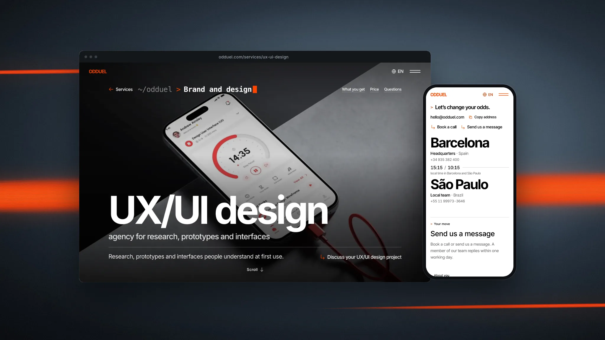
At Odduel, a creative and technology agency in Barcelona and São Paulo, forms get as much design attention as hero sections in our UX and UI design service, because they are where results are won or lost.
In short: cut every field you do not use, put labels above fields, keep one column, group related fields, use the right input types and autocomplete, validate gently after each field, write errors that say how to fix the problem, make the button say what happens, and test with real people on phones.
How do you improve form conversion?
Start with the questions you ask, then fix how you ask them.
Ask for less
List every field and write next to it what you do with the answer. If nobody uses it, delete it. If it is useful but not essential, make it optional or ask later, after the first conversion. A contact form rarely needs a job title, a postal address or “how did you hear about us” to start a conversation.
Make the remaining fields effortless
Use clear labels, sensible input types, autocomplete and examples where formats are unusual. Each field should take one glance to understand and one action to fill.
Remove doubt at the button
Tell people what happens next and when: “Send enquiry. We reply within two working days” is more reassuring than “Submit”, provided the promise is true. Show the privacy notice link close to the button, not hidden at the foot of the page.
What are the form design best practices, field by field?
Labels
- Put a visible label above each field. Placeholder text inside the field disappears as soon as people type, so it cannot replace a label.
- Write labels in the visitor’s words: “Work email” rather than “E-mail address (corporate)”.
- Mark optional fields as “(optional)” rather than marking every required field with an asterisk, when most fields are required.
On our own website, each field keeps its label for screen readers, and the label appears as a small line above the field once it holds a value, so people always know what they typed where.
Layout
- Use one column. People read forms top to bottom; side-by-side fields are often skipped or filled in the wrong order.
- Group related fields under short headings, such as “About you” and “About the project”.
- Size fields to their expected content: a postcode field can be short, a message field should be tall.
Input types and autocomplete
- Use the right input type so phones show the right keyboard: email, telephone, number, date.
- Add the HTML autocomplete attribute to name, email, telephone, address and payment fields, so browsers and password managers can fill them.
- Be tolerant of formats: accept a website address without “https://”, a phone number with spaces, a postcode in lower case. Normalise it on the server instead of rejecting it.
Choices
- Use radio buttons for a few exclusive options, checkboxes for multiple choices and a select menu only for long lists.
- Large tappable chips work well for picking services or budgets on phones.
- Do not pre-select consent checkboxes; in the EU, consent must be an active choice.
Validation and errors
- Validate each field when the person leaves it, not on every keystroke, and never wipe what they typed.
- Write errors that explain the fix: “Enter an email address like name@company.com” rather than “Invalid input”.
- Show the error next to the field, in text as well as colour, and move focus to the first field with a problem after a failed send.
- Keep a summary at the top for long forms, linking to each field with an error.
Buttons and confirmation
- Make the button label say what happens: “Send enquiry”, “Book a call”, “Create account”.
- Disable double submission while sending, and show progress.
- Confirm success clearly, with what happens next. A dedicated thank-you page also makes conversions easy to measure.
Which form patterns work and which hurt completion?
| Pattern | Effect on completion | Better alternative |
|---|---|---|
| Labels above fields | Helps: fast to scan | Keep |
| Placeholder text as the only label | Hurts: label vanishes when typing | Visible label plus optional hint |
| One column | Helps: clear order | Keep |
| Multiple columns | Hurts: fields skipped | One column, grouped sections |
| Optional fields marked “(optional)” | Helps: clear effort | Keep |
| CAPTCHA puzzles | Hurts: frustration, accessibility barriers | Invisible spam checks, rate limits, honeypot fields |
| Errors only after submitting | Hurts: surprise and rework | Inline validation when leaving a field |
| Generic “Submit” button | Neutral to negative | Action-specific label |
| Multi-step form with progress | Helps on long forms | Keep for long forms only |
What are the steps in form design work?
- Define the goal. What must the form achieve, and what does the team need to act on it?
- Audit the current form. Count fields, note which answers are used, and look at analytics for drop-off by field if available.
- Cut and reorder. Remove unused fields, make others optional, and order the rest from easy to harder.
- Write the microcopy. Labels, hints, errors, button text and the confirmation message.
- Design the layout and states. Empty, focused, filled, error, disabled and success, on phone and desktop.
- Build with semantic HTML. Real labels linked to fields, correct input types, autocomplete and accessible error messages.
- Test with real people. Five people filling the form on their own phones will reveal most problems.
- Measure after launch. Track starts, completions and errors per field, and adjust.
Form work fits inside a wider design process; our guide to the UX design process shows where it sits.
How do you make forms accessible?
Accessible forms are easier for everyone. The W3C’s forms tutorial sets out the techniques; the essentials are:
- Every field has a programmatically linked label, not only visual text nearby.
- Instructions and formats are given before the field, not only in a tooltip.
- Errors are announced to screen readers and described in text, never by colour alone.
- Everything works with a keyboard, with a clearly visible focus indicator.
- Contrast of labels, hints, field borders and errors is sufficient on the real background.
- Time limits are avoided, or can be extended.
For consumer services in the EU, accessibility is also a legal matter under the European Accessibility Act. An accessibility check belongs in every form review; our UX audit checklist includes it.
How do privacy rules shape form design in Europe?
Forms collect personal data, so the GDPR’s principles show up directly in their design:
- Data minimisation: ask only what you need, which also helps completion.
- Clear information: link the privacy notice near the button and say briefly how the data will be used.
- Active consent: marketing consent is a separate, unticked checkbox, not bundled with the enquiry.
- Security: forms are served over HTTPS and protected against spam without tracking people before consent.
Good privacy design and good conversion design point the same way: fewer fields, clearer words, no tricks.
How long does it usually take?
Improving an existing contact or enquiry form is a matter of days: an audit, revised fields and copy, a design pass, a build and a round of testing. Complex forms, such as quotes, applications or multi-step checkouts, take longer because each step needs its own design and testing, and often involve the systems that receive the data.
For business portals with long forms, the effort is closer to a product project; our article on B2B portal UX covers forms in that context.
What are the most common mistakes?
- Asking for data nobody uses. Every extra field costs completions.
- Placeholders instead of labels. People forget what a field was for once they start typing.
- Strict formats. Rejecting a phone number because of a space or a website without “https://”.
- Errors that blame. “Invalid entry” without saying what is expected.
- Clearing the form after an error. Forcing people to retype everything is the fastest way to lose them.
- Hiding the privacy notice. Uncertainty at the last step makes people hesitate.
- No confirmation. People unsure whether the form was sent often send it again or give up.
Questions people ask
How do you improve form conversion?
Remove every field you do not use, make the rest effortless with clear labels above each field, one column, correct input types and autocomplete, validate gently as people go, write errors that explain the fix, label the button with the action and confirm success clearly. Then test on real phones and measure drop-off by field.
What are the steps in form design?
Define the goal, audit the current form and its drop-off, cut and reorder fields, write labels, hints, errors and button text, design every state on phone and desktop, build with semantic HTML, test with five real people and measure starts, completions and errors per field after launch, adjusting as the data shows.
Should form labels go above or inside the field?
Above. A visible label above each field is fast to scan and stays in place while people type. Placeholder text inside the field disappears as soon as typing starts, which makes people forget what the field was for and causes problems for screen reader users. Use placeholders only for short format hints.
How long does it take to redesign a form?
Improving a contact or enquiry form usually takes a few days: an audit, revised fields and copy, a design pass, the build and testing. Long or complex forms such as quotes, applications or checkouts take longer, because each step needs design and testing and the receiving systems often need changes too.
What are the most common form design mistakes?
Asking for data nobody uses, using placeholders instead of labels, rejecting reasonable formats, vague error messages, clearing the form after an error, hiding the privacy notice and giving no clear confirmation. Each one adds friction at the moment a visitor has already decided to act, so fixing them often lifts completion quickly.
Print your main form, write next to each field what you do with the answer and cross out the ones nobody uses; that alone often lifts completion. If you want your forms designed and tested properly, see our UX and UI design service or tell us about your project.