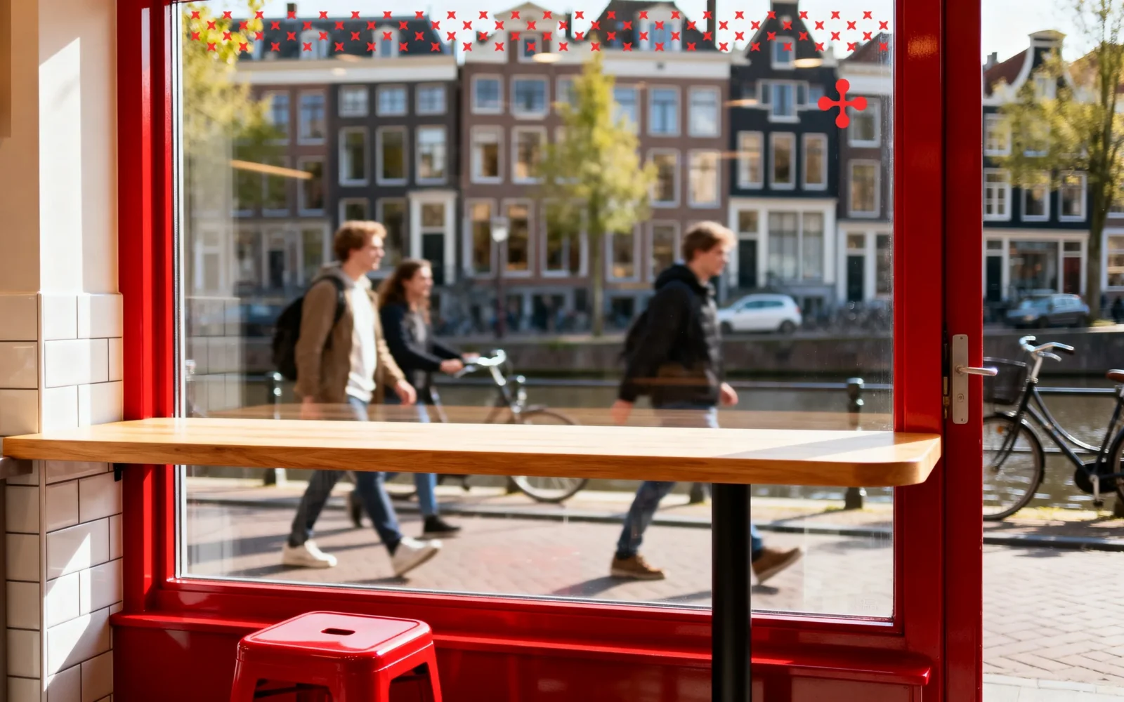
Brand identity, packaging and website
Brand identity and website for a sandwich shop
- Sector
- Food
- Location
- Netherlands
- Year
- 2026
- Services
- Branding, Website development
- Website
- nothingtoeat.online
The brief
A sandwich brand, from the logo to the website.
Nothing To Eat makes classic sandwiches in Amsterdam: fresh ingredients, generous portions, and nothing started until you order it. Food like that deserves a queue. First it has to get noticed.
So the job was a sandwich brand identity people recognise from across the street, packaging that advertises while it is carried, and a website that takes a hungry visitor straight to the menu. All of it had to feel like the same place.
The idea
A name everyone already says.
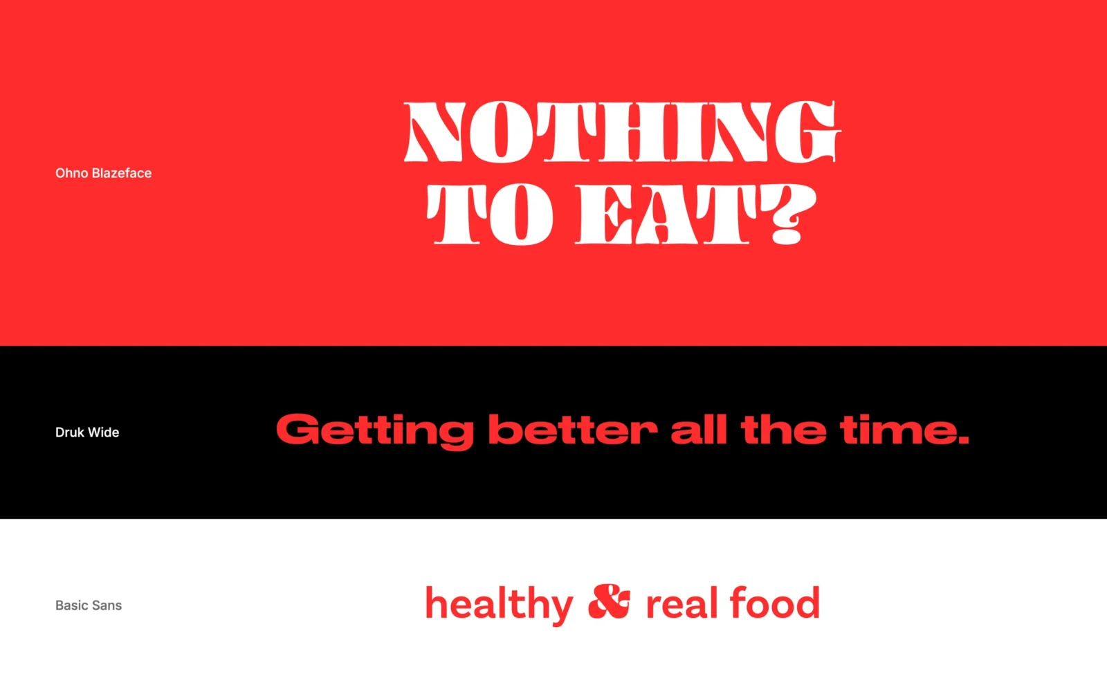
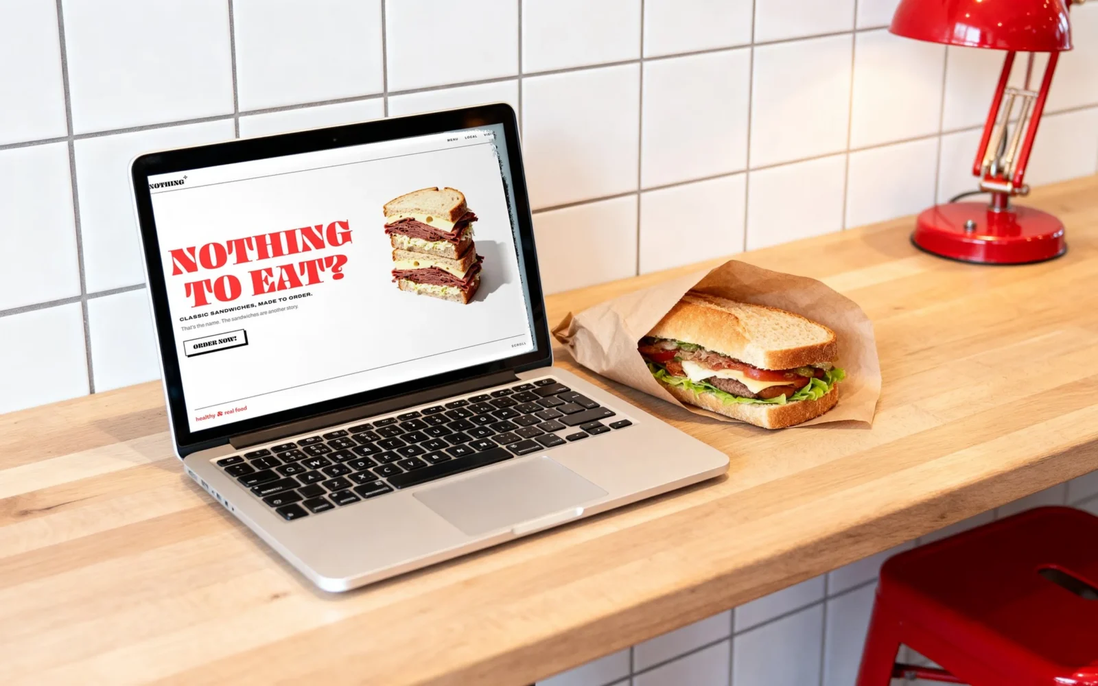
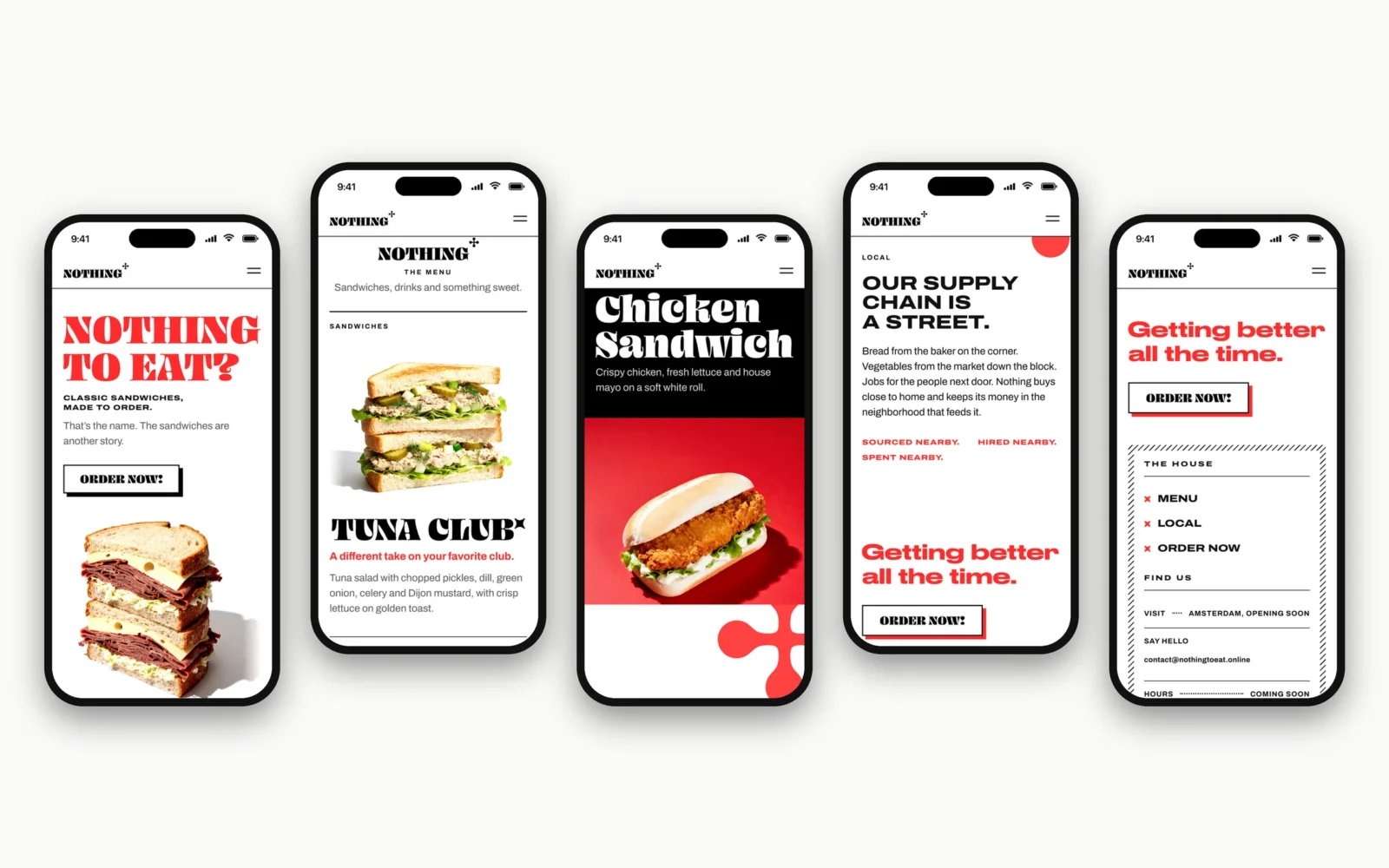
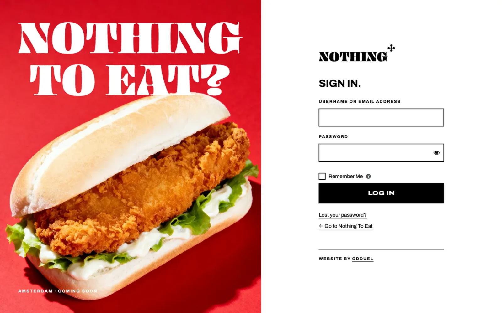
Everyone has stood at an open fridge and said it. So we did not dress the name up. We put it to work: “NOTHING TO EAT?” in heavy white capitals on red, and one answer underneath, “ORDER NOW!”. A question and its answer, and every piece of the brand comes back to them. The logo keeps only the first word, so each bag and box says “NOTHING” while holding something very good. It is a joke customers finish for themselves.
What we made
A small set of rules that is hard to get wrong.
The logo
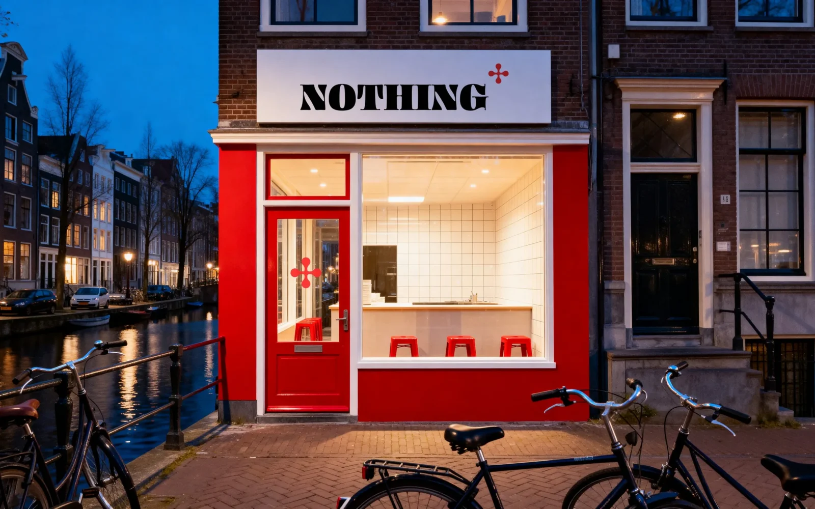
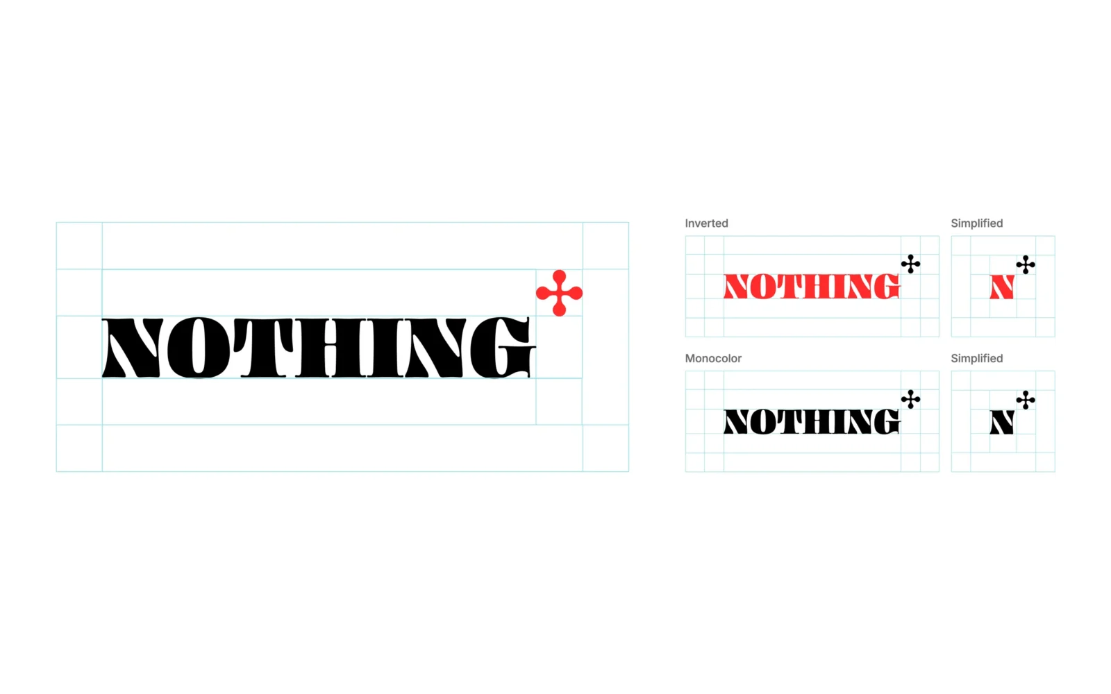
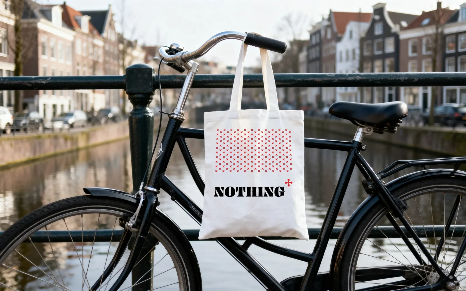
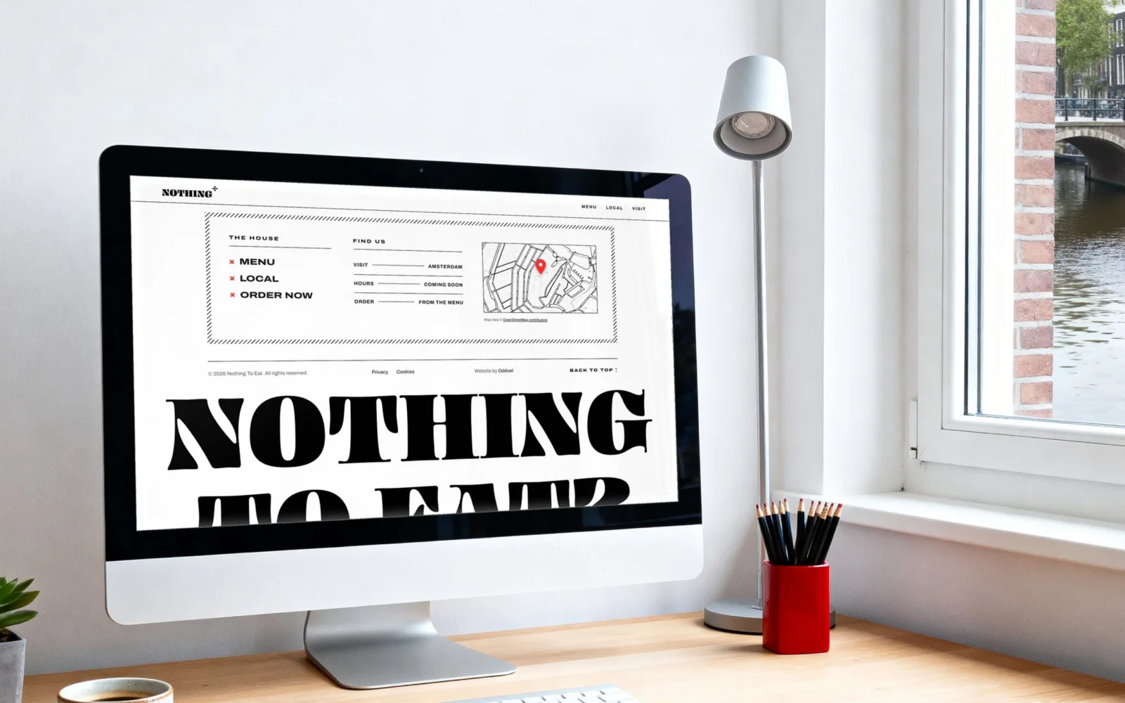
One word and a wink: “NOTHING”, with a small red plus that promises more. It reads as well on a shop sign as on a sticker.
The pattern
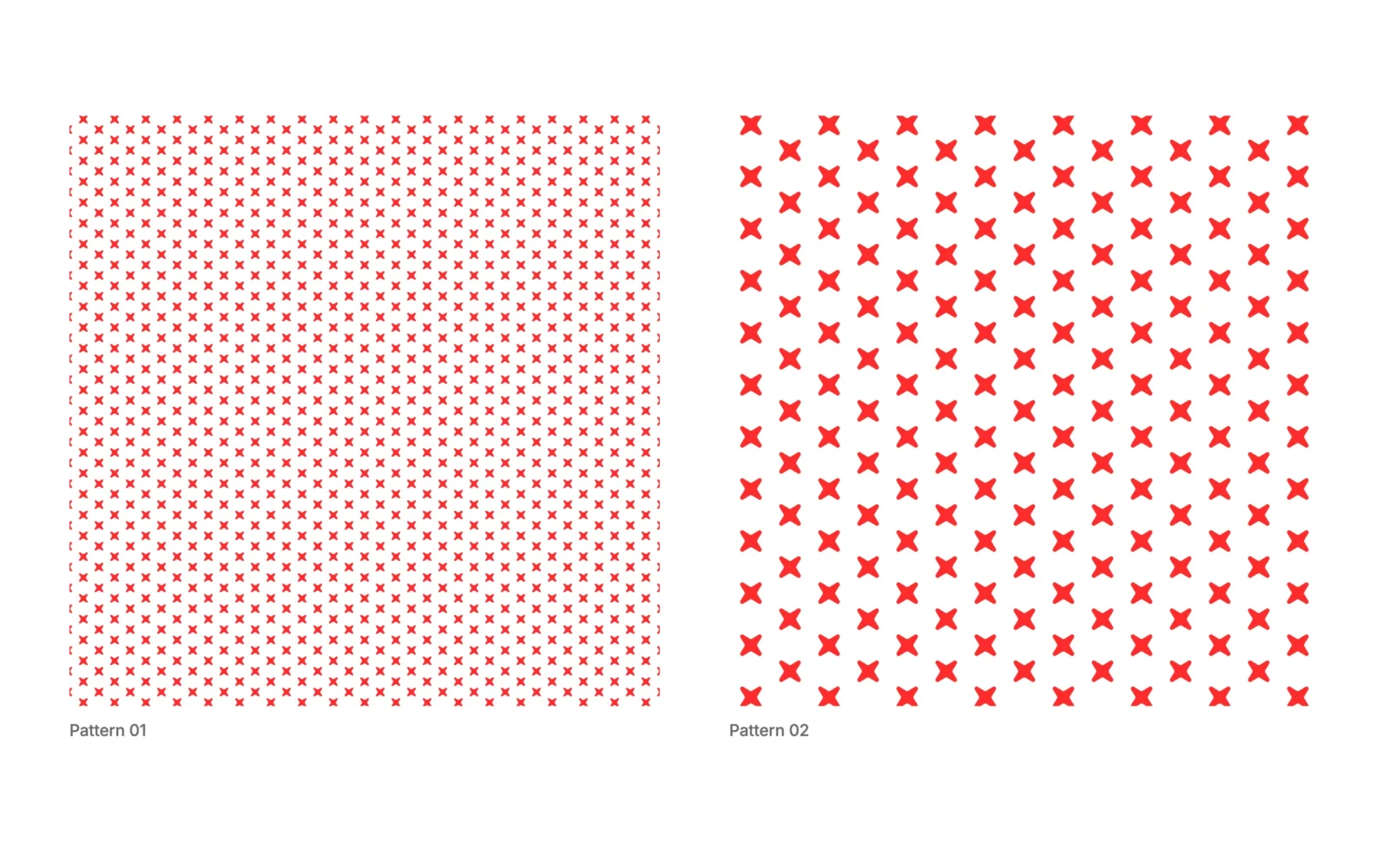
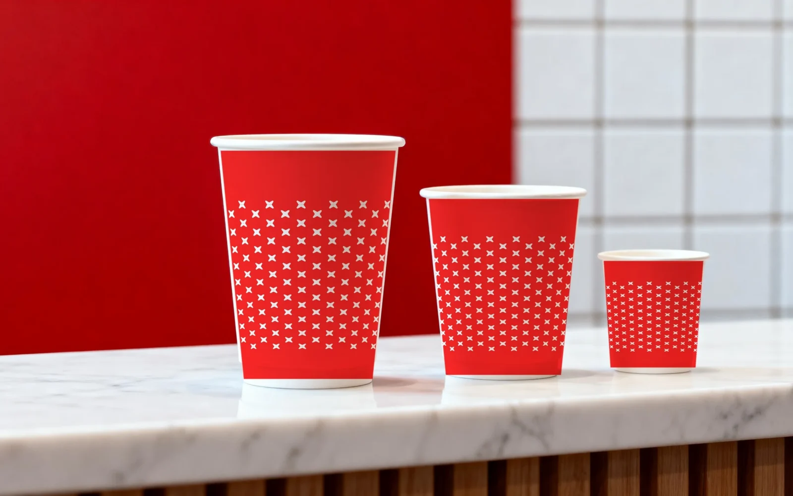
The cross from the logo, repeated until people know the brand before they read a word.
Colour and lettering
Red to get noticed, white to breathe, black to sign off, and letters loud enough to ask the question.
The packaging
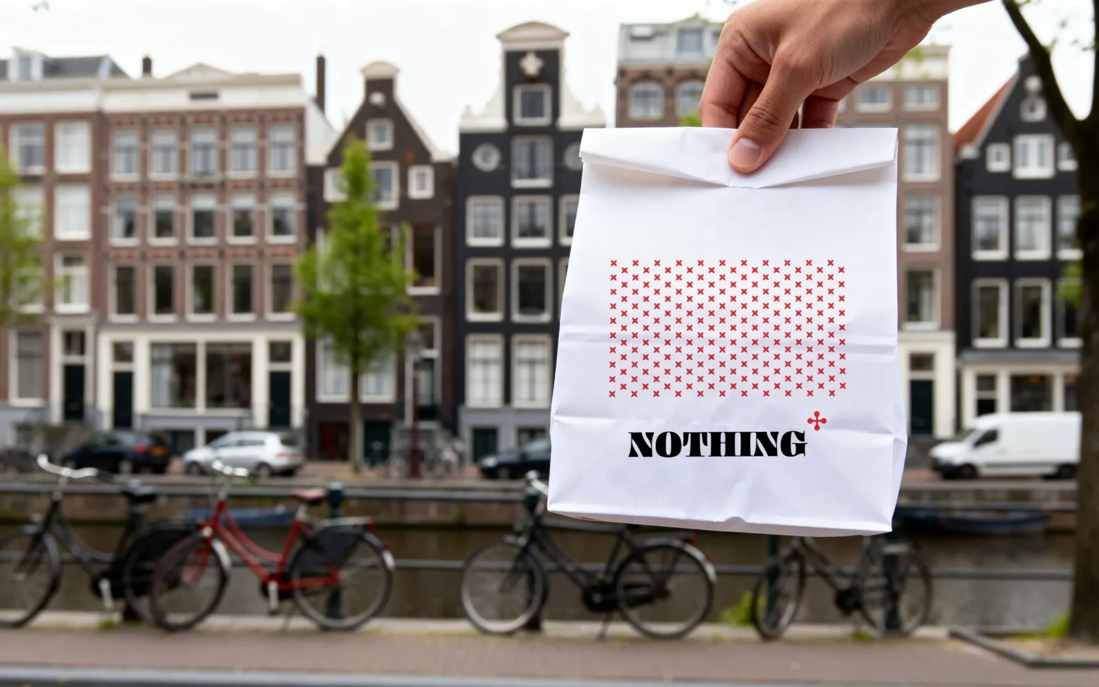
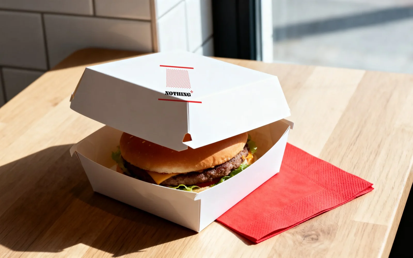
Bag, box, cups and tote carry the logo and the crosses, so every order walks the brand down the street.
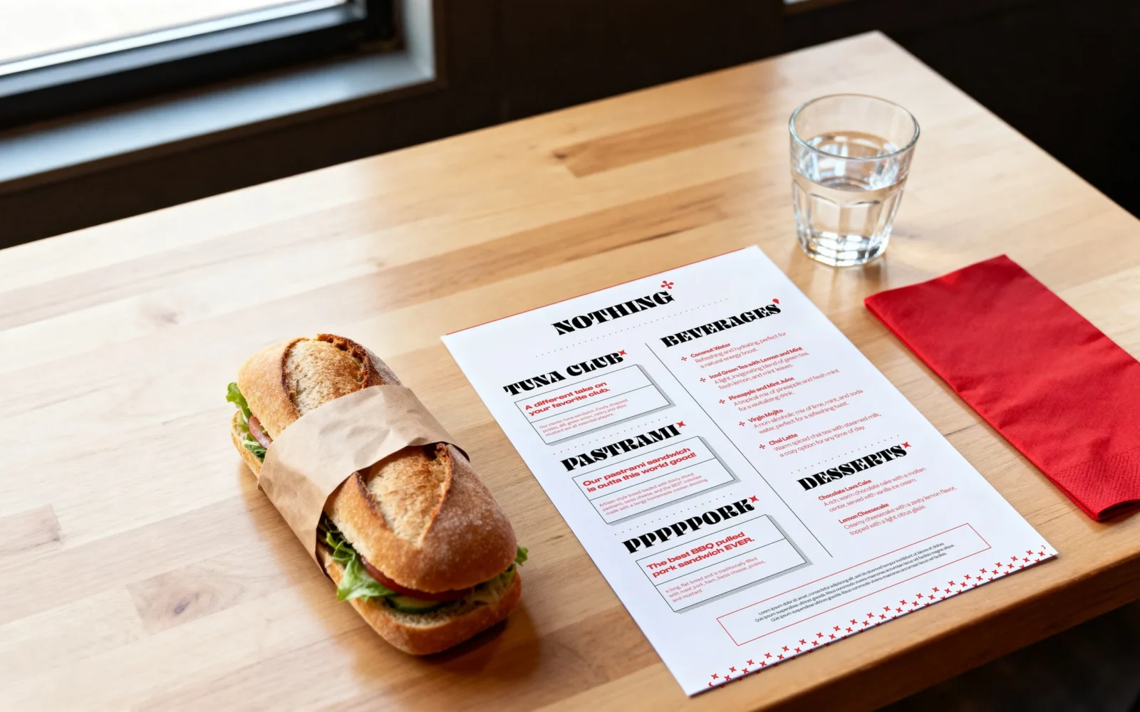
The menu
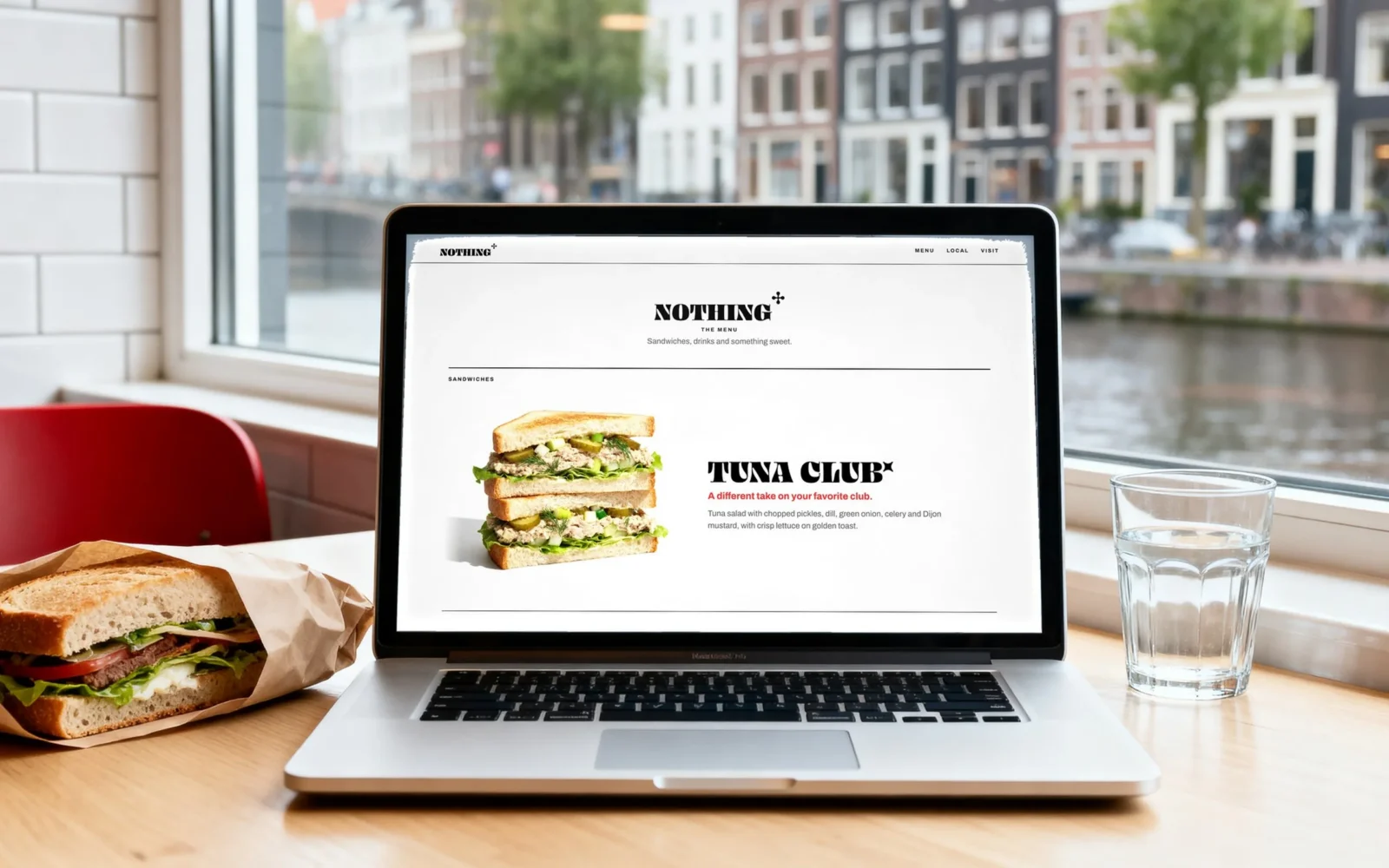
Each sandwich gets room of its own, so choosing takes seconds.
The website
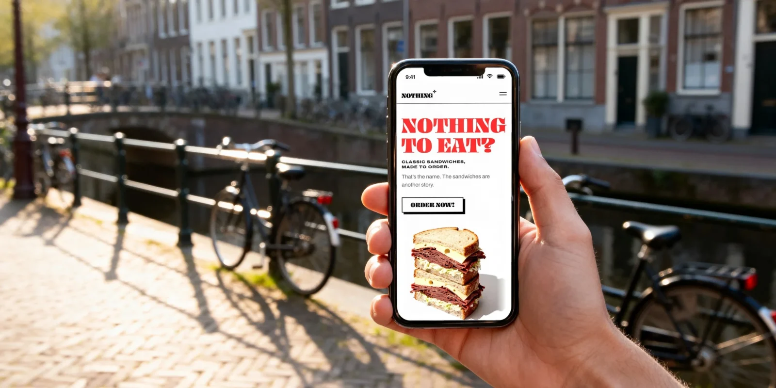
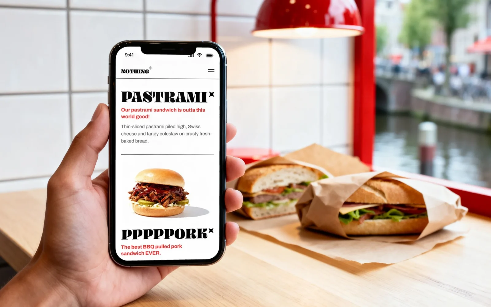
The question, a sandwich and one button that leads straight to the food. Made for a phone first.
The back office
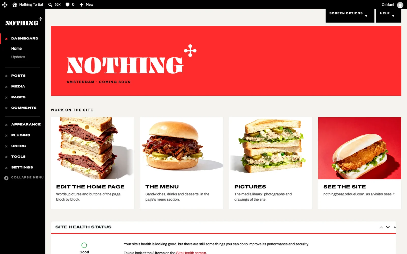
A dashboard in the brand’s own red, where a sandwich or a photograph is changed in minutes.
In motion
A brand this simple was made to move. The full set of films is on Behance.
In the world
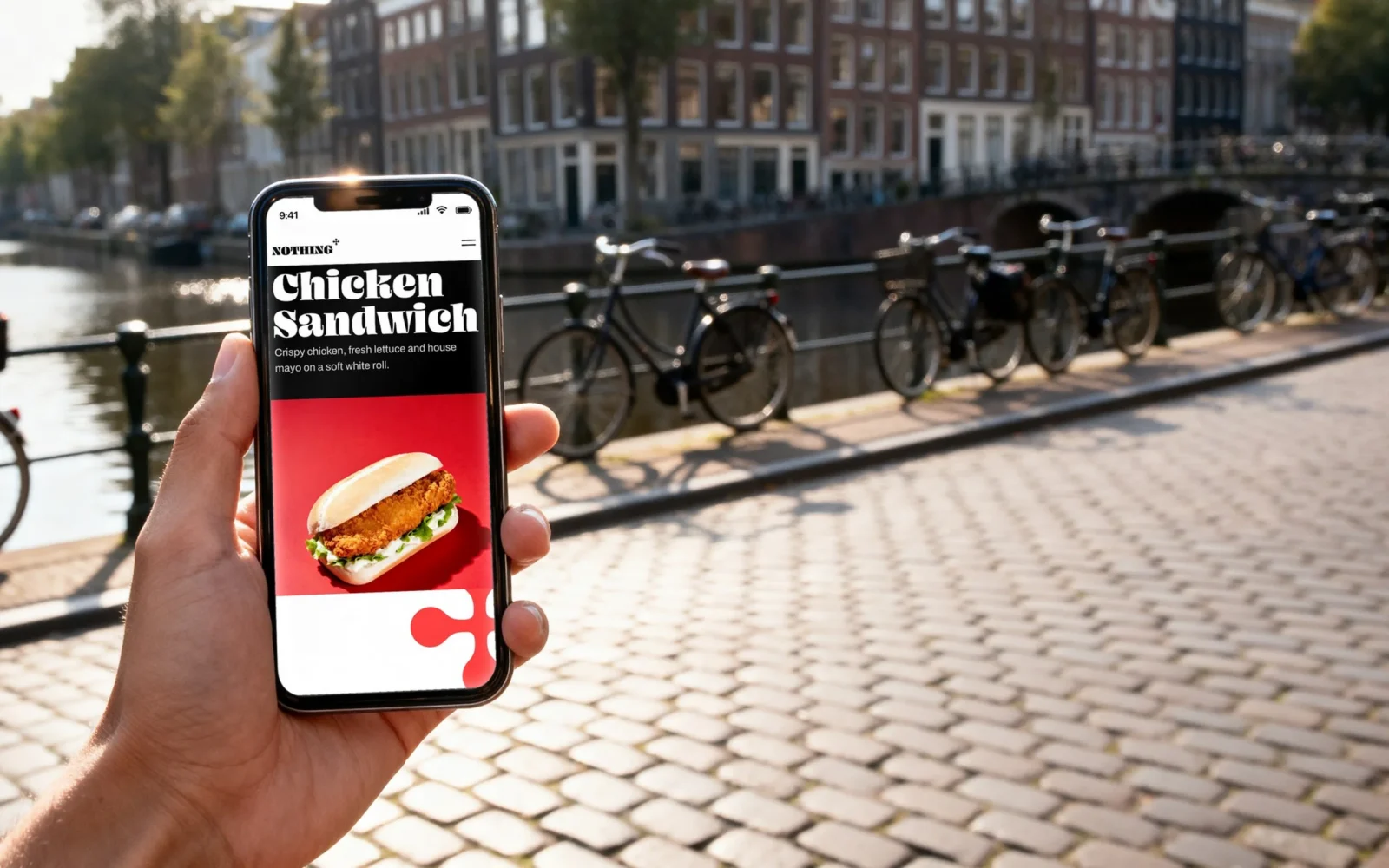
In a hand, on a counter, on a phone.
A brand for the street has to work on the street, so every piece was judged where it will be seen. The website is open now. Go in hungry.
Delivered
A brand ready for the street.
Nothing To Eat now has a complete brand: logo, pattern, packaging, menu, a website and a back office it runs without calling us. Every piece asks the same question, so a customer who meets one recognises the next.
Agency: Odduel. Creative direction: Luciano Panachão.
Your turn
Opening a place, or running one that deserves to be better known?
See how we approach branding and website development, then tell us about your brand.